
In a recent quiz, I happened to stumble upon a tiny subset of hitters, namely those represented by the yellow area in the extreme upper right-hand corner of the chart below. In that post, I noted the recent increase in the number of such hitters and speculated on what might be causing this uptick.
More on batters with a high XBH to SLG ratio after the jump.
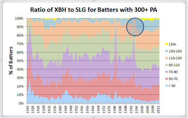
Firstly, let me explain what this chart is showing. The different colored areas represent the percentage of hitters in each season (min. 300 PA) who had a ratio of XBH to SLG percentage within the indicated range. Note particularly the second band from the top (blue) and how, together with the adjacent yellow and orange bands, it suddenly increased starting in 1995 (circled area), with the blue band more than doubling in size, seemingly overnight. In the following analysis, I’ll attempt to explain that sudden change and why, though ebbing somewhat in the most recent seasons, that change continues to persist.
What kind of hitters have high XBH to SLG ratios? For example, these were the players in 2013 with a ratio above 150.
| Rk | Player | XBH | PA | Age | Tm | G | AB | R | H | 2B | 3B | HR | RBI | BB | SO | Pos | ||||
|---|---|---|---|---|---|---|---|---|---|---|---|---|---|---|---|---|---|---|---|---|
| 1 | Chris Davis | 96 | .634 | 673 | 27 | BAL | 160 | 584 | 103 | 167 | 42 | 1 | 53 | 138 | 72 | 199 | .286 | .370 | 1.004 | *3/D |
| 2 | Jay Bruce | 74 | .478 | 697 | 26 | CIN | 160 | 626 | 89 | 164 | 43 | 1 | 30 | 109 | 63 | 185 | .262 | .329 | .807 | *9 |
| 3 | Matt Carpenter | 73 | .481 | 717 | 27 | STL | 157 | 626 | 126 | 199 | 55 | 7 | 11 | 78 | 72 | 98 | .318 | .392 | .873 | *45/H39 |
| 4 | Manny Machado | 68 | .432 | 710 | 20 | BAL | 156 | 667 | 88 | 189 | 51 | 3 | 14 | 71 | 29 | 113 | .283 | .314 | .746 | *5 |
| 5 | Anthony Rizzo | 65 | .419 | 690 | 23 | CHC | 160 | 606 | 71 | 141 | 40 | 2 | 23 | 80 | 76 | 127 | .233 | .323 | .742 | *3/H |
So, it’s not really the power hitters (unless, like Chris Davis, they have an absolute monster season). Don’t believe it? Here’s the same chart, but restricted to players slugging .500 in a season.
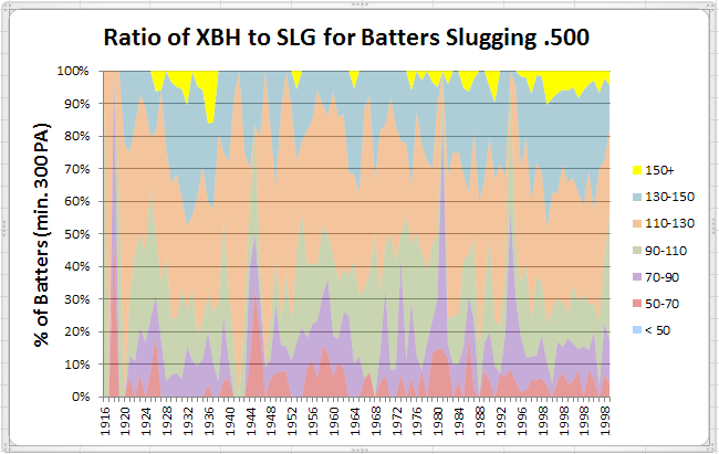
Clearly, a greater proportion of hitters in the higher bands, but still a sizable proportion in the lower bands.
So, those players in the highest bands do seem to be those with high ABs and high extra-base hit totals, but a relatively small number of home runs. But, there have always been players like that. So, why are there so many more players today with higher XBH to SLG ratios?
Let’s look first at how slugging percentage has changed over the years.
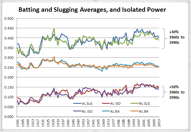
So, with a sizable increase in isolated power since the 1960s, there has also been a rise (though not as pronounced) in slugging percentage. Note, though, that while isolated power has declined only slightly since the 1990s, there has been a larger drop in slugging percentage over the same period.
Looking further into changes in hit patterns, we see this.
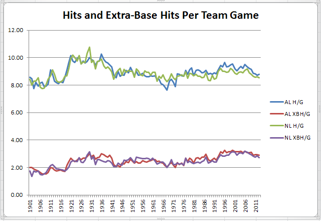
Similar story. After rising rapidly into the early 1990s, overall hit totals have dropped much faster than extra-base hit totals. That can be seen more clearly in the following two charts, showing trends for each hit type.
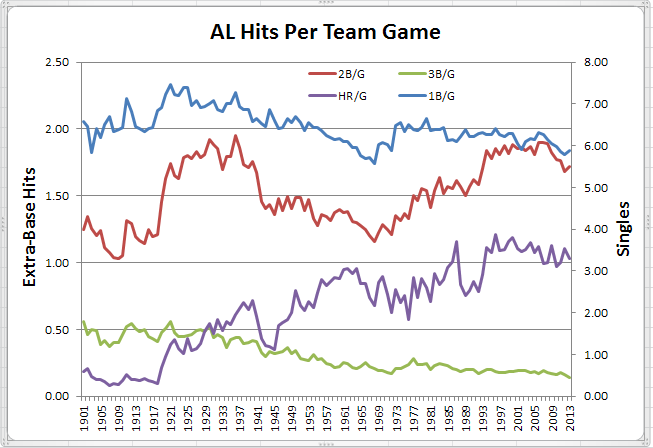
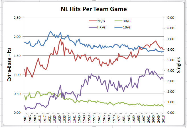
Similar story for both leagues, except for home runs, which are currently holding steady in the AL but are dropping in the NL. Note also that unlike the post-war period that saw home runs increase rapidly while doubles declined, doubles and home runs have moved mostly in step since the early 1970s. Lastly, note that triples have declined steadily since the 1920s in both leagues, as have singles (though, more slowly) except that the introduction of the DH interrupted and later moderated the decline of singles in the AL.
The changes in types of hits have, of course, resulted in changes in the composition of slugging percentage as shown in the following two charts.
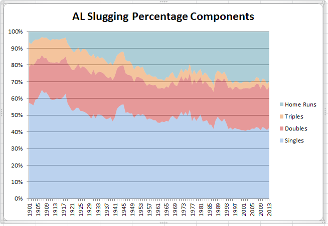
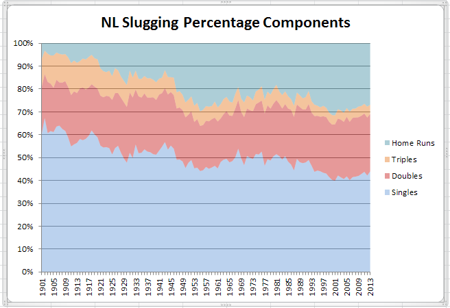
Similar picture for both leagues, with the proportion of slugging percentage attributable to home runs increasing six-fold since the dead-ball era, while the proportion resulting from singles has dropped by a third. Though the proportion of slugging resulting from triples has declined by more than two-thirds, the combined proportion of slugging resulting from both doubles and triples has been fairly constant, at about 30%-35% of overall slugging percentage.
While the decline in singles can be largely explained by their “replacement” with more extra-base hits, I think there is another factor at play as well. Take a look at the next two charts, breaking down the PAs in each game by their outcome.
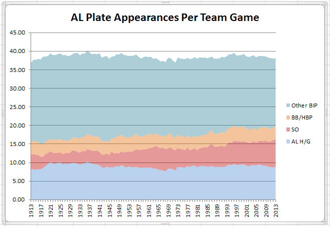
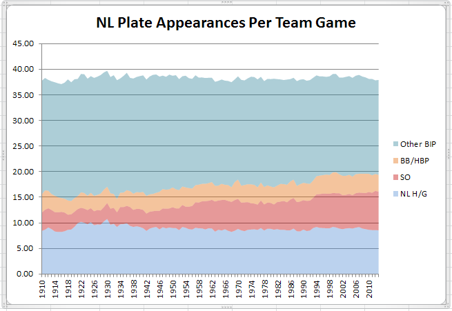
On the scale of the entire game, changes in total PAs, hits and walks seem remarkably small. Instead, the biggest change has been in strikeouts which has had the effect since the dead-ball era of reducing by about 25% the number of balls in play other than hits. Certainly some of the increase in extra-base hits has resulted from the willingness of batters to accept more strikeouts. But, beyond substituting extra-base hits for singles, those increased strikeouts have further reduced singles simply by reducing balls in play.
A circuitous route, perhaps, but this last notion of singles being further reduced simply from a reduction in balls in play brings us back to the first chart and the original question of why recent hitters are having higher XBH to SLG ratios. Bearing in mind that, even though much reduced, singles remain the largest single component of slugging percentage, the proportion of singles “lost” from a reduction in balls in play could well be the difference between today’s hitters and those of earlier years, and a contributing factor to hitters getting less bang for the buck (so to speak) in terms of slugging percentage gains resulting from their increased extra-base hits.
Your turn now.