
Continuing my series on WAR in the wild card era, this post looks at team WAR, broken out among position players and pitchers. There’s a long preface here, dealing with terms and such; those in a hurry can scroll down to the first major heading, “WAR/pos and WAR/pitch.” (Just look for the charts.)
Terms and Conditions
WAR/pos = WAR from position players
WAR/pitch = WAR from pitchers
wWAR = Team Wins predicted by WAR = Team WAR + (Games x .294)
- .294 is the winning-percentage definition of replacement level, equivalent to 47.6 wins in 162 games.
- So, for a 162-game schedule, wWAR = Team WAR + 47.6.
wPyth = Pythagorean wins
wAct = Actual wins
All figures herein are based on a 162-game season.
wWAR Correlates Best with wPyth
wWAR should correlate better with Pythagorean wins than with actual wins, because WAR is meant to account for the building blocks of runs scored and runs allowed, which are the components of wPyth. Actual wins varies from wPyth due to different efficiencies of (a) turning those building blocks into actual runs (like the Cardinals’ .330 average with RISP this year) and (b) turning runs into actual wins (like the 2012 Orioles’ incredible one-run record). And grit, of course. WAR is mostly blind to those things.
Anyway, wWAR does correlate better with Pythagorean wins: For 1995-2013, the average difference between wWAR and wPyth was plus/minus 3.3, while the average difference between wWAR and wAct was 4.3. Therefore, when I look at the relationship of team WAR to performance, I mean wPyth.
The correlation of wWAR and wPyth holds pretty steady across the spectrum of team quality. I found the average gap between wWAR and wPyth for five tiers of teams, based on their wPyth. Tier 1 is the top 10% of all teams, by wPyth; Tier 2 is the next 20%; Tier 3 is the middle 40%; Tier 4 is the next 20%; and Tier 5 is the bottom 10%. The average gap between wWAR and wPyth (plus or minus) ranged from 3.6 for Tier 1, down to 3.2 for Tier 3, and back up to 3.5 for Tier 5.
The straight averages of wPyth and wWAR of those tiers:
- Tier 1: 98.4 wPyth … 99.0 wWAR … +0.6 wWAR
- Tier 2: 90.6 wPyth … 90.5 wWAR … -0.1 wWAR
- Tier 3: 81.5 wPyth … 81.5 wWAR … No difference
- Tier 4: 71.0 wPyth … 71.2 wWAR … +0.2 wWAR
- Tier 5: 63.2 wPyth … 63.7 wWAR … +0.5 wWAR
I see no obvious tendency for wWAR to favor or disfavor any particular caliber of team, at least in this era.
Leagues Apart
The average American League team has 6.6 WAR more than the NL average, 37.1 to 30.5. The WAR formula for this era explicitly favors AL teams, due to their .524 W% in interleague play, equivalent to 85-77 in a team season. (See B-R’s “War Explained,” 2nd paragraph below the graph; the numbers there are out of date after this year’s lowering of replacement-level W% to .294.)
AL superiority creates just a slight difference in wAct or wPyth, because interleague play is a small part of the schedule. But the edge is applied to their whole season WAR: they’re still better teams, even while playing each other to a net .500 record. Consequently, AL teams average 3.2 more wWAR than wPyth, while NL teams average 2.6 less.
This bias creates some of the gap between wWAR and wPyth. Without it, the average gap between wWAR and wPyth falls to about +/- 2.1, strengthening the correlation.
Is the size of the AL’s WAR edge appropriate? Applying their interleague W% to 162 games yields an AL edge of 7.8 wins, while the WAR edge is 6.6. It would be hard to argue that the WAR formula is too generous to the AL.
I have chosen to disregard the AL/NL gap for most parts of this study.
What WAR Misses
Clutch hitting. That’s because offensive WAR is based on offensive components (singles, doubles, etc.), not actual runs. Teams that score many runs more or less than those components suggest should have the biggest gaps between wPyth and wWAR, and vice versa. These teams had the biggest gaps between wPyth and wWAR:
- +11.7, 2013 Cardinals — Did I mention their historic .330 BA with men in scoring position?
- -10.9, 2001 Angels — AL’s worst in all RISP slashes; RISP BA was .022 less than with bases empty.
- -10.6, 2010 Mariners — AL’s worst in all RISP slashes, though not much worse than they were with bags empty. This was the worst offensive team in the period, by most measures; maybe the formula is less accurate with such extremes?
- -9.8, 1998 Rays — Worst in this era for RISP BA relative to overall BA. And, although that suppressed their wPyth, they still undershot their wPyth by 4, giving them the worst (wAct-wWAR) for the period. But I’ve digressed long enough; on with the post!
____________________
WAR/pos and WAR/pitch
There are 564 teams in this pool. Per 162 games, the average team had:
- 33.6 total WAR
- 19.9 WAR/pos (59.3% of total)
- 13.7 WAR/pitch (40.7%)
The 3:2 ratio of WAR/pos to WAR/pitch reflects that some of run prevention is attributed to defensive WAR, which goes to position players. But in another sense, there’s almost as much WAR “in play” on both sides, since the spread from the highest to lowest figures is similar: 52.0 in WAR/pos (from 50.9 for the sublime 2001 Mariners to -1.1 by the ridiculous 2013 Marlins), 49.0 in WAR/pitch (from 37.2 by the 2011 Phillies to -11.8 by the 1995 Giants). The discrepancy between the 3:2 ratio and the similar spread is because negative values are far more common in WAR/pitch than WAR/pos (16 to 3 for teams in this pool).
The average WAR figures for the five tiers based on total WAR:
(Tier 1 = top 10%, Tier 2 = next 20%, Tier 3 = middle 40%, Tier 4 = next 20%, Tier 5 = bottom 10%)
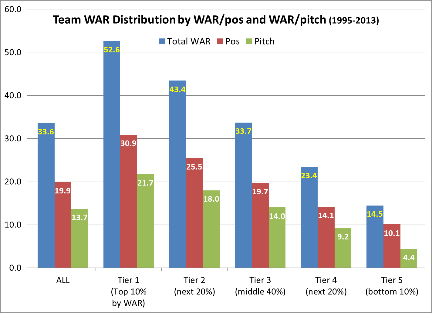
(Note that numbers do not always add up, due to rounding.)
And the percentages of WAR/pos and WAR/pitch:
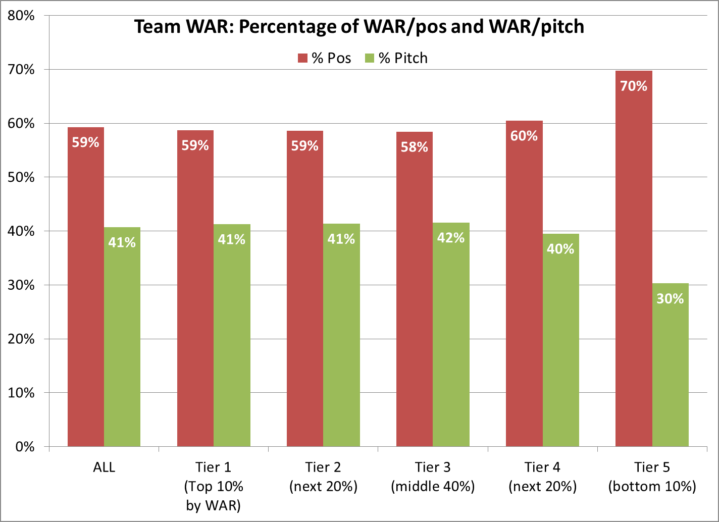
For Tiers 1-3, the proportions of WAR/pos and WAR/pitch are nearly identical, and quite close to the overall average. Tier 4 tilts a tad more towards Pos, and Tier 5 even more so; most really bad teams have disastrous pitching. But even with that dip at Tier 5, the old saw that pitching is the shortest path to success is not borne out by this data. The increments between tiers mostly tilt toward WAR/pos:
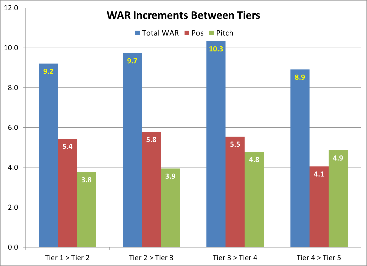
The gap from the middle pack to the elite is 11.2 WAR/pos, 7.7 WAR/pitch; from bottom to top, it’s 20.8/17.3. Every team has different needs, so there’s no “right” way to improve. But if recent history is a guide, then a team wanting to reach the next level is likely to need more gains on the positional side than in pitching.
Outliers
Among Tier 1, the highest concentrations of WAR in pos or pitch:
Heavy on WAR/pos:
- 2001 Mariners, 75% (68.0 WAR, 50.9 pos/17.1 pitch), record 116-46 — The team that won the most games in this era (or any) also scored the most WAR and WAR/pos (by far), but ranked 6th in AL WAR/pitch.
- 1999 Indians, 74% (47.8, 35.2/12.6), record 97-65 — The only team since 1950 to score 1,000 runs, but ranked 10th in AL WAR/pitch.
- 2011 Rays, 74% (50.2, 36.9/13.3), record 91-71, and (next on the list) 2010 Rays, 73% (49.2, 35.8/13.4), record 96-66 — These Tampa teams were above-average in run prevention but subpar in WAR/pitch, as much of the credit went to their innovative defense (#1 in dWAR for the two years combined). These teams ranked 2nd and 3rd in AL offensive WAR, but dWAR made them 1st in WAR/pos.
Heavy on WAR/pitch:
- 2011 Phillies, 70% (53.2 WAR, 16.0 pos/37.2 pitch); record 102-60 — By far the highest concentration in WAR/pitch for any very good team in this era, maybe in any era. Roy Halladay, Cliff Lee and Cole Hamels ranked #1, 2 and 6 in MLB WAR/pitch, averaging 8.0 WAR and a 2.51 ERA, and the team’s WAR/pitch and 3.02 ERA were this era’s best by far. Philly led the majors in wins and run differential, but they were NL-average in OPS+ and 11th in WAR/pos.
- 1997 Yankees, 58% (56.5, 23.7/32.8); record 96-66 — 2nd-best WAR/pitch in this era, but 6th in AL WAR/pos that year. Defensive WAR hated them, especially their outfield.
- 2008 Cubs, 58% (50.3, 21.1/29.2); record 97-64 — Clear NL leader in WAR/pitch, but 6th in WAR/pos. Cubs led NL in ERA+, and their WAR/pitch was further boosted by a subpar defensive WAR.
It’s probably a coincidence, but despite excellent records, none of these seven teams reached the World Series, and all but Seattle lost in the first round. We’ll look at more World Series stuff in another post.
One-year Turnarounds
Intuitively, pitching seems more volatile — a few pitchers often control the bulk of a team’s WAR/pitch, and pitchers show more year-to-year variance in performance, in part due to a higher injury rate than position players. So one might think pitching plays the lead role in sudden team improvement. But actually, teams with sharp one-year gains in total WAR got a little more of that edge from WAR/pos:
- +10 or more WAR from a year ago: +7.8 WAR/pos, +7.2 WAR/pitch
(96 teams, avg. +15.0 WAR)
Breaking that into two classes:
- +15 or more WAR from a year ago: +10.2 WAR/pos, +9.4 WAR/pitch
(37 teams, avg. +19.6 WAR) - +10.0 to 14.9 WAR from a year ago: +6.2 WAR/pos, +5.8 WAR/pitch
(59 teams, avg. +12.0 WAR)
In sharp one-year declines, the role of WAR/pos is even bigger:
- -15 or more WAR from a year ago: -11.0 WAR/pos, -9.1 WAR/pitch
(33 teams, avg. -20.1 WAR) - -10.0 to 14.9 WAR from a year ago: -7.8 WAR/pos, -4.2 WAR/pitch
(51 teams, avg. -11.9 WAR)
And again, while it might seem easier to achieve sharp gains in pitching, it just isn’t so:
- +10 or more in: WAR/pos, 61 teams; WAR/pitch, 46 teams
- +15 or more in: WAR/pos, 22 teams; WAR/pitch, 18 teams
Incidentally, teams that made sharp gains in either category tended to lose a little ground in the other one:
- +10 or more WAR/pos: average +14.0 WAR/pos, but -2.8 WAR/pitch
- +10 or more WAR/pitch: average +14.2 WAR/pitch, but -1.9 WAR/pos
This isn’t surprising, since teams often address a weakness by dealing from their strength.
An Optimal Ratio?
Could there be hidden value in having a certain ratio of WAR/pos to WAR/pitch, creating more wins (Pythagorean or actual) relative to total WAR?
I sorted the teams by their Pos/Pitch ratio (highest to lowest), then split them into three groups of 188 teams: Pos-Heavy, Normal, and Pitch-Heavy. For each group, I found the average net wins above WAR wins — in terms of both wPyth and wAct — and expressed that as compared to the average of other two groups.
In this first chart, the main thing is the small scale of the differences; none approaches one full win:
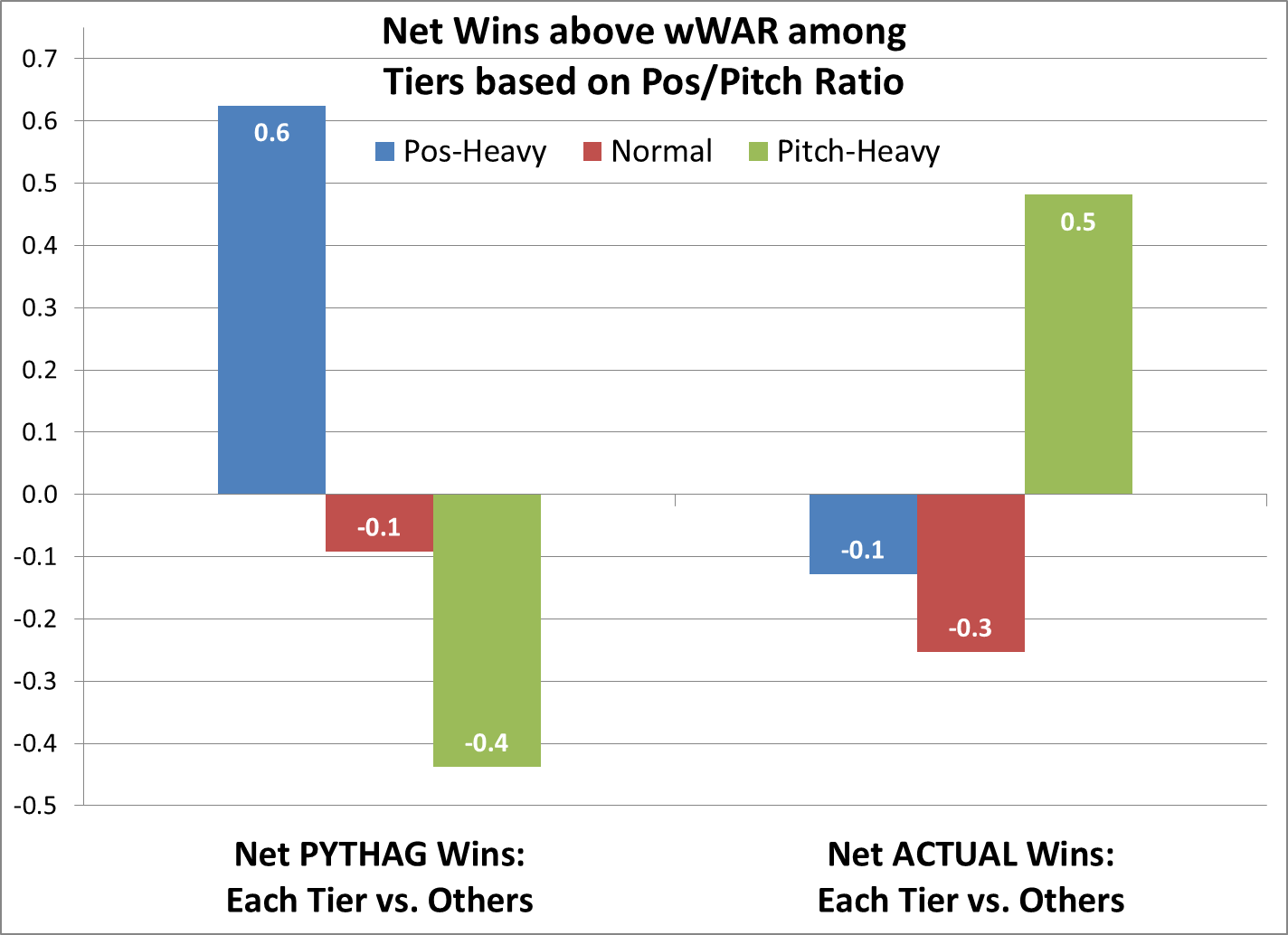
What to make of this? While wPyth seems to favor Pos-Heavy and disfavor Pitch-Heavy, the Pitch-Heavy teams fare best in wAct.
I won’t look for much meaning in the actual wins data. I think gaps between actual wins and wWAR mainly come from clutch hitting and one-run efficiency, neither of which has been shown to be a repeatable skill, in the main.
The wPyth data seem a bit counterintuitive, because of the Pythagorean formula itself: A given amount of runs improvement has more wPyth impact as run prevention than as run production. Take an average 2013 NL team, with 650 runs scored and allowed; their wPyth is 81. Add 80 runs scored, their wPyth is 89.6. But if you instead subtract 80 runs allowed, their wPyth is 90.7.
That’s not a perfect model, because runs scored and allowed are not perfect stand-ins for WAR/pos and WAR/pitch. Some of WAR/pos is defensive WAR, which is run prevention. Still, offensive WAR is the lion’s share of WAR/pos. So it’s surprising to see Pos-Heavy teams fare better in wPyth than Pitch-Heavy.
But again, the actual differences are small.
To refine this approach, I split the teams into five equal groups of 113 teams, again by their Pos/Pitch ratio: Hi-Pos, Pos, Normal, Pitch, and Hi-Pitch. Again, we’re comparing each group’s net wins above wWAR against the average of the other groups:
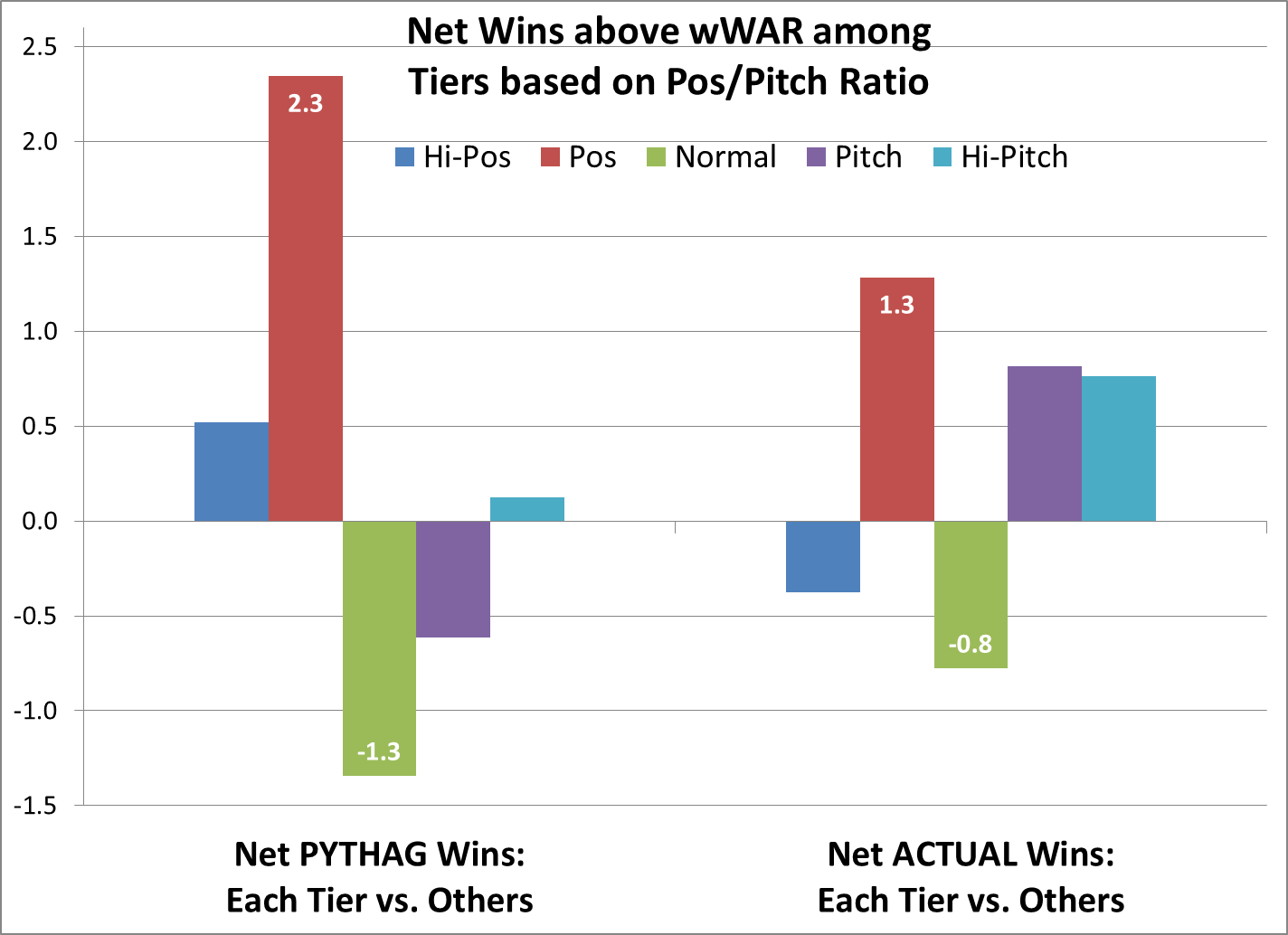
Now, the scale is bigger, and the picture’s a bit more consistent between wPyth and wAct. Teams skewing somewhat towards WAR/pos fare best in both wPyth and wAct. But this one seems odd: Those with the most normal proportions fare worst in both wPyth and wAct.
Lastly, the reverse approach: Now the five tiers are based on net wins above wWAR, for wPyth and wAct. The graph shows each tier’s average WAR/pos as a percentage of total WAR. The first set is based on net wPyth, the second on net wAct:
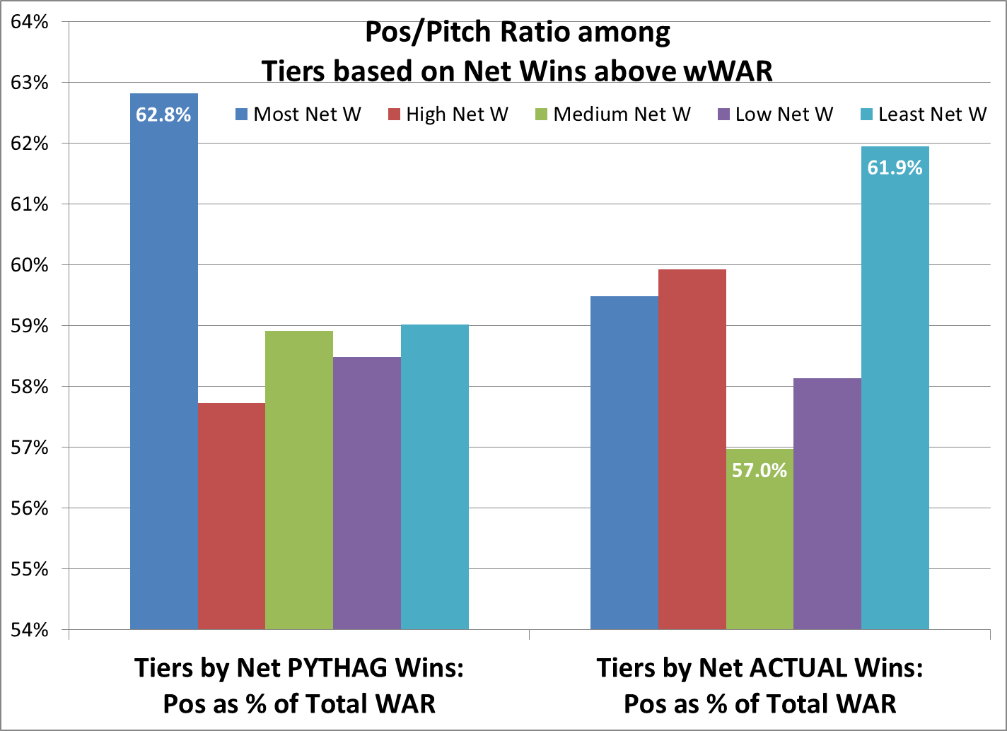
As in the first Net Wins chart, very different results for Pythag wins and actual wins. Those faring best in wPyth are skewed towards WAR/pos — but so are those faring worst in wAct.
But again, the scale of the differences is pretty small. The entire range in this chart is just 57.0% to 62.8%. Six out of seven teams in this pool are outside that range.
I’d love to hear your interpretations. For now, I think it’s mostly noise. Consider that second Net Wins chart, especially the Pythag side. Can you build a narrative for those first three bars? Suppose you take a team in the Hi-Pos group, and then start steadily trading small bits of WAR/pos for WAR/pitch. If these data mean something, then somewhere along that progression, your Pythagorean expectation goes up measurably; but watch out! — if you trade yourself into a normal ratio, your wPyth plunges. That just doesn’t smell right.
Well, we’ve come to the end of another long post. I hope you enjoyed it, and please share your thoughts and suggestions below!