
Daniel Murphy‘s history-making run of 6 consecutive post-season games with a home run is one of this October’s most notable stories.Less well-known, perhaps, is Murphy’s prowess in making contact, ranking 2nd (first in the NL) in making contact on 92% of his swings, and leading all of baseball with a batted ball in play (AB – SO + SH + SF) in 86.8% of his PAs.
But, when you take in this year’s Fall Classic, remember to cast a glance at the Royals’ second baseman too. Ben Zobrist is no slouch himself when it comes to making contact. More on Murphy, Zobrist and contact hitters after the jump.
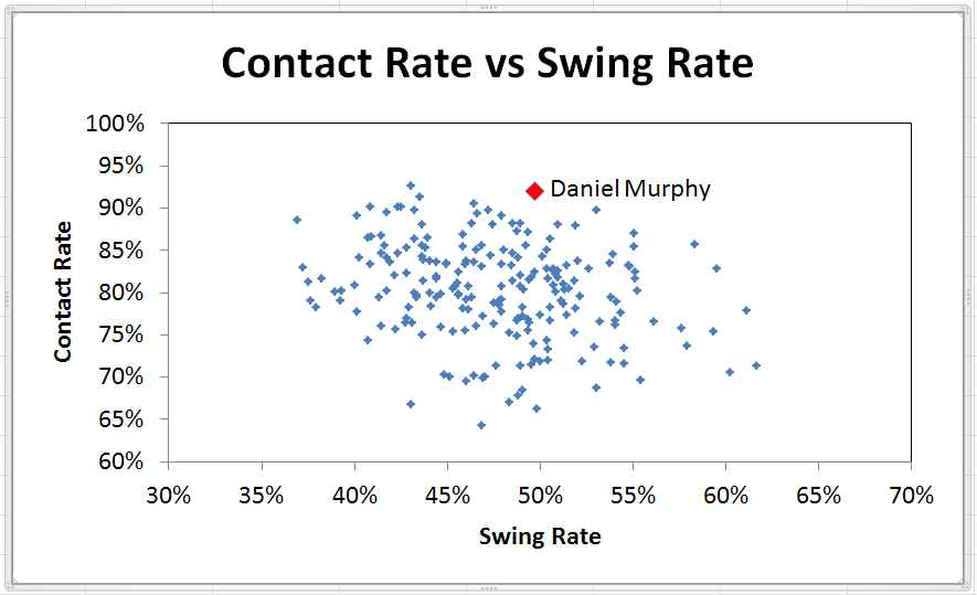
That majors-leading BIP% is a product of Murphy’s 92% contact rate plus a 49.7% swing rate that ranks in the top third of 211 players with 400 PA this season, as depicted below.
 With such a high BIP rate for Murphy, there weren’t many PAs left for other outcomes, as shown below.
So, Murphy’s top BIP % is complemented by the best strikeout rate in the majors. Somewhat surprisingly, though, strikeout rate does not correlate that strongly with making contact. The chart below shows contact rate NOT as a percentage of swings, but as a percentage of pitches. Other than at the extremes, there is a fairly broad range of strikeout rates (from 10% to 30%) for most of the range of contact rate values.
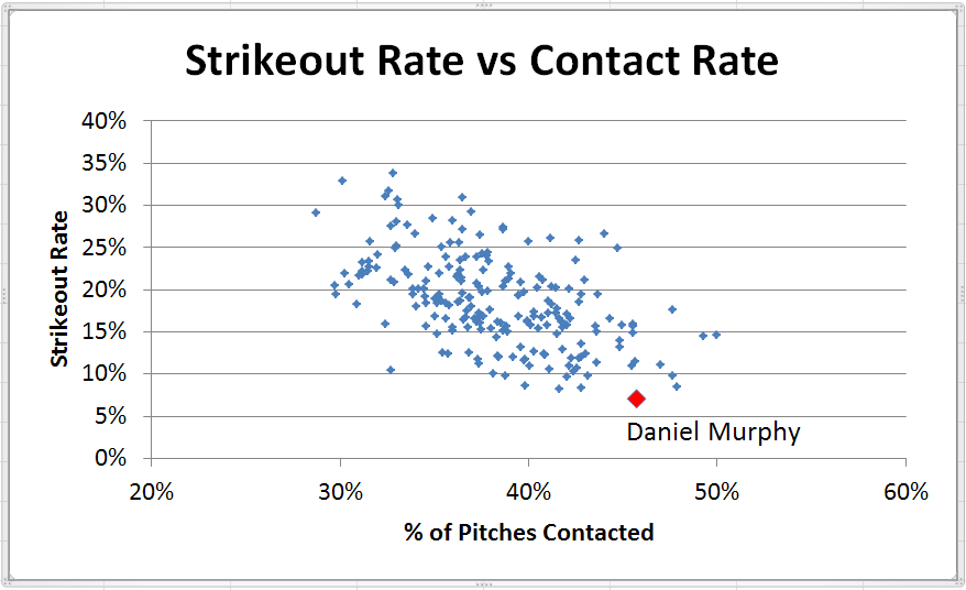 Why is the correlation above not stronger? Probably because very different hitters can have similar contact rates. For example, players with a low swing rate and a high percentage of swings making contact could end up making contact with about the same proportion of pitches as players with a high swing rate and a lower proportion of swings making contact. Intuitively, one would expect the former group to have a better strikeout rate than the latter but, with similar percentages of pitches contacted, you get the chart above showing a broad range of strikeout rates for most contact rate values.
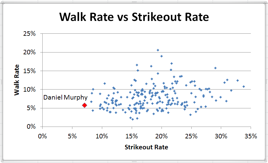
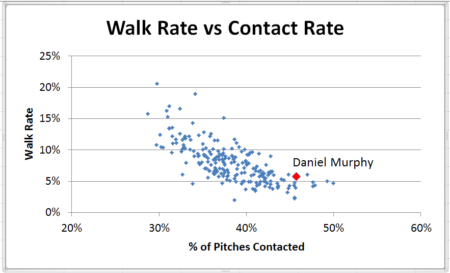
But, it’s a different story for walk rate and BIP rate, both of which show stronger correlations to contact rate that would be expected intuitively.
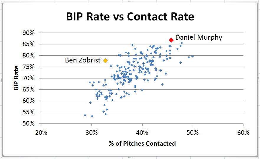
You’ll note the second player I identified in the chart directly above. Ben Zobrist, the other second baseman in this year’s Series, shows an above average BIP rate, despite a contact rate well below the norm. In fact, while Zobrist put the ball in play in more than 75% of his PAs, every other player contacting as few pitches as Zobrist showed a BIP rate below 70%, most far below that level.
What Zobrist did more frequently than any other player this season was put the ball in play when he swung and made contact. To illustrate this, I’ve invented a couple of metrics just for fun. The first is Swing Efficiency, measured as one less than % of PA with BIP divided by % of Pitches Swung At (with the subtraction of 1 intended to make the number look something like an OPS score). Thus,
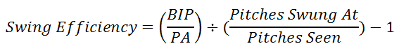
Similarly, Contact Efficiency is one less than % of PA with BIP divided by % of Pitches Contacted.
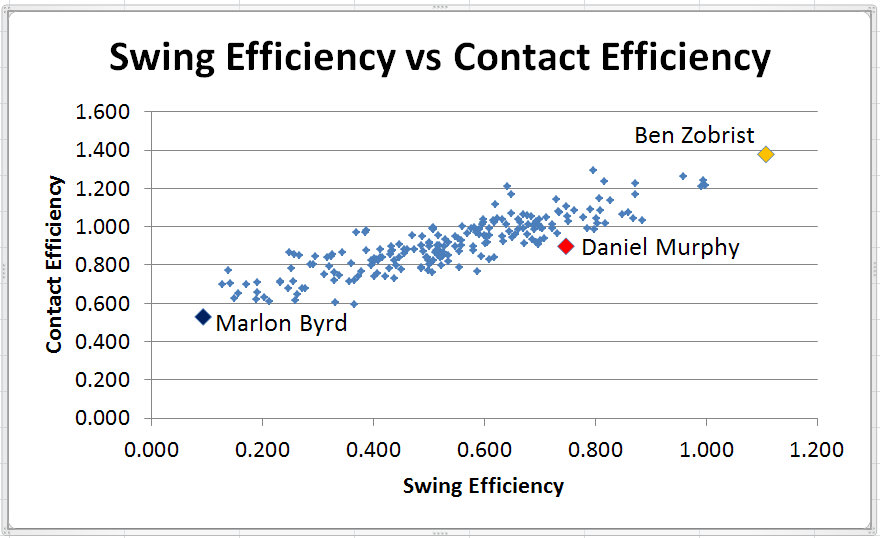
Plotting the two against each other shows the players on a continuum, but with Zobrist far ahead of any other player (at the other extreme is the unfortunate Marlon Byrd who swung at a phenomenal 61.6% of the pitches he saw, but made contact on only 71.4% of his swings).
Thanks to FanGraphs.com for the data used for this post. Click here to see the data for all 211 players in the study.
The scatter graph between K-rate and contact rate doesn’t look that dissimilar from the scatter of the BB-rate and contact rate graph, to me anyway. It looks like there are more outliers, but the trend line is pretty similar.
Also, I can’t access the linked Google doc at the end of the article again. Would be interested to see who the player is with the 10% K rate and 33% contact rate.
The stronger correlation I was seeing was that pretty much everybody with a walk rate under 5% had a contact rate over 40%, and those with a walk rate over 10% had a contact rate under 40%. For strikeouts, players with contact rates in the 35% to 45% range could have strikeout rates anywhere from 10% to 25% without much pattern to the relationship. Just seemed visually to me that the walk rates were much tighter in their relation to contact.
My hypothesis as to why the relationship between contact and strikeouts is not so strong is that there are two types of low contact hitters – those who swing a lot and don’t make as much contact, and those who are much more selective when they swing and make more consistent contact. Intuitively, the latter group should have lower strikeout rates than the former group. But, with the two groups mixed together and exhibiting similar contact rates, you can’t see that visually in a scatter graph.
Sorry about the link to the spreadsheet. You should be able to see it now. The player you were curious about is Stephen Souza.
That makes sense w/r/t the two types of guys who have lower contact rates. It also jives with why the BB rate graph is “tighter” because you really can’t have a good walk rate without being selective/swinging less.
Thanks for the fix and for the article!