
“The less often the ball is in play, the more likely a no-hitter becomes.”
Tom Verducci wrote that in a June 2012 Sports Illustrated column titled, “Flurry of no-hitters and perfect games reflect changes in baseball.” You’ve probably heard the same claim elsewhere.
It sounds good in theory, and it may hold for individual games. But on a league-wide basis, it’s not supported by results in the current era, once you look beyond a very small sample. The high-strikeout era as a whole has actually seen a decline in no-hitters, compared to prior rates.
_______________
Mr. Verducci’s column ran right after Matt Cain’s perfect game, the fifth no-hitter in less than half a season (including Seattle’s teamwork job). He focused on a very small period, from 2010 through mid-June 2012, and showed a rate of 1 no-hitter per 414 games. (He counted each matchup as one game.) Then he ominously compared that to the 1901-2009 average of 1 per 794 games, and more ominously to the 1967-69 rate of 1 per 345 games. (Uh-oh, look we’re we’re going….)
Reaction to last year’s flurry was inevitable, and Verducci was not the only one to sound an alarm. But such a small sample maximizes the effect of random distribution, as you can see in the yearly raw numbers. Easy example: There was one no-hitter in 1988-89 combined, then 14 over the next two years. You can’t expect to show anything about no-hitters in just a few years, because they are so rare. A small window shows many anomalies like these:
- 1951 had the highest individual no-hit rate in the live-ball era, despite a fairly low K rate (9.7%). Then the K rate soared in 1952-55, while the no-hit rate plunged.
- In 1973 there were 5 no-hitters, the 8th-highest no-hit rate in the live-ball era, despite the lowest overall K rate since 1961. Four of those no-hitters came in the league that had just introduced the DH, and so had the much lower K rate.
Such small samples are meaningless.
In almost a year since Verducci’s column (over 4,000 team-games), we’ve seen just 2 more no-hitters, a very normal rate. We’ve had none yet this year, despite the highest K rate ever. So the individual rate for 2010-present is down from his cited rate of 1/414 games to 1/571 games. But non-events rarely get noticed.
I’m not suggesting that there’s no connection between strikeouts and no-hitters. Obviously, no-hit pitchers are generally strikeout leaders, and especially those with more than one no-no — Ryan, Koufax, Feller, Bunning, Randy Johnson, Verlander, etc.
I only mean to show two things:
(1) Despite the 2010-12 flurry, the current high-strikeout era has actually seen a low rate of no-hitters, compared to historic norms.
(2) A correlation of K rates and no-hit rates can only be seen over a period of many years, and the correlation seems broken during the last 20 to 30 years. For just a small group of years, no-hitters are fundamentally more random than they are predicted by K rates. Their raw numbers are so small that the rate for even a 20-year period can be strongly affected by outliers like Nolan Ryan (4 in a 3-year span) and Sandy Koufax (4 in 4 years).
_______________
Quick notes on my methods:
- The period studied is the live-ball era, i.e., 1920-2012. The current season is excluded.
- I included combined no-hitters, to remove the effect of variance in complete-game rates. In the graphs, the bars for individual and total no-hitters are overlaid, so that any combined no-hitters will appear as a darker extension of the individual bar.
- When I speak of a pitcher game, it means his entire stay in the game. I would have preferred to ignore MLB’s restrictive definition of “no-hitter” and include all games where the starter did not allow a hit for at least 9 innings, regardless of what happened afterwards. However, I can’t get those from the Play Index. For what it’s worth, one source lists 6 such games during the study period: 1934 (Bobo Newsom), 1956 (Johnny Klippstein), 1959 (Harvey Haddix), 1965 (Jim Maloney), 1991 (Mark Gardner) and 1995 (Pedro Martinez). I did include the one non-complete game wherein the starter threw 9 no-hit innings and then left. (Francisco Cordova, this one‘s for you.)
- I express no-hit rates per 10,000 team-games; each game played between two teams counts as two team-games. Strikeout rates (or K rates) are a percentage of plate appearances.
_______________
Now vs. Then
The first thing I wanted to see was how our current era of very high K rates compares to previous norms, in terms of no-hit rates. If there is a strong, direct correlation between K rates and no-hitters, we would expect a high rate of no-hitters in this era.
But how should we define this era? I see two possible starting points:
(1) 1986: In 1986, the K rate jumped from 14.0% to 15.4% — a large one-year change, and a K rate not seen since 1968 — and since then it has never dipped below 14.7%.
So here are the rates of no-hitters per 10,000 team games, for 1986-2012 and before:
- 1986-2012: 4.8 individual (5.2 total); 16.6% K rate for the period
- 1920-1985: 6.4 individual (6.6 total); 11.5% K rate
A hard right to the theory’s chin! The no-hit rate for this 27-year period is significantly lower than for the previous 66 years of the live-ball era.
As an aside, the period just before this one, 1969-85, had a much higher no-hit rate, 6.5 (6.8), very close to the previous norm, but with just a 13.5% K rate. It also had 5 no-hitters by Nolan Ryan. Even for a long period, outliers have a large impact.
(2) 1995: The period 1995-2012 consists of the 18 highest season K rates in MLB history. (And 2013 looks to be another new record.) No-hitter rates for 1995-2012, and before:
- 1995-2012: 4.4 individual (4.7 total); 17.2% K rate
- 1920-1994: 6.1 individual (6.3 total); 12.1% K rate
And a left to the body! Not only is the no-hit rate for 1995-2012 much lower than the previous norm, despite an unprecedented K rate, it’s also lower than for 1986-2012, our alternate definition of the “high-K era.”
Slicing the current era any thinner makes the samples too small to be relevant. Yes, the no-hit rate for 2010-12 was very high, 10.3 per 10,000 team-games — not as high as 1990-92 (11.9) or even 1969-71 (11.1), but still eye-catching. But that eye-catching rate actually underlines my point: Those years stand out starkly against the rest of the high-K era. No other 3-year span in this era reached 7.0, and if you lop off 2010-12, the average was 3.5 for 1995-2009, 4.7 for 1986-2009.
And in terms of K rates, why start a study period in 2010? The K rate has climbed steadily every year starting with 2006. Year by year: 16.8% strikeouts in 2006 (1 no-hitter); 17.1% in 2007 (3 no-hitters); 17.5% in 2008 (2 no-hitters); 18.0% in 2009 (2 no-hitters), 18.5% in 2010 (5 no-hitters). What is the basis for starting with 2010?
I suppose it’s conceivable that there’s a K-rate threshold above which a small rise would have an exponential effect on no-hit rates. But I haven’t seen that argument made.
_______________
But let’s not count out the correlation theory just yet. Let’s look at some graphs of no-hitter rates and strikeout rates over time, to see if we can spot a trend with the naked eye.
Our first graph shows annual rates of no-hitters (the blue bars, graphed against the left axis) and strikeouts (the red line, graphed against the right axis). Again, the no-hit rate is expressed per 10,000 team-games, while the SO% is a percentage of all plate appearances. Individual and total no-hitters are overlaid.
Rates of No-Hitters and Strikeouts by Year, 1920-2012
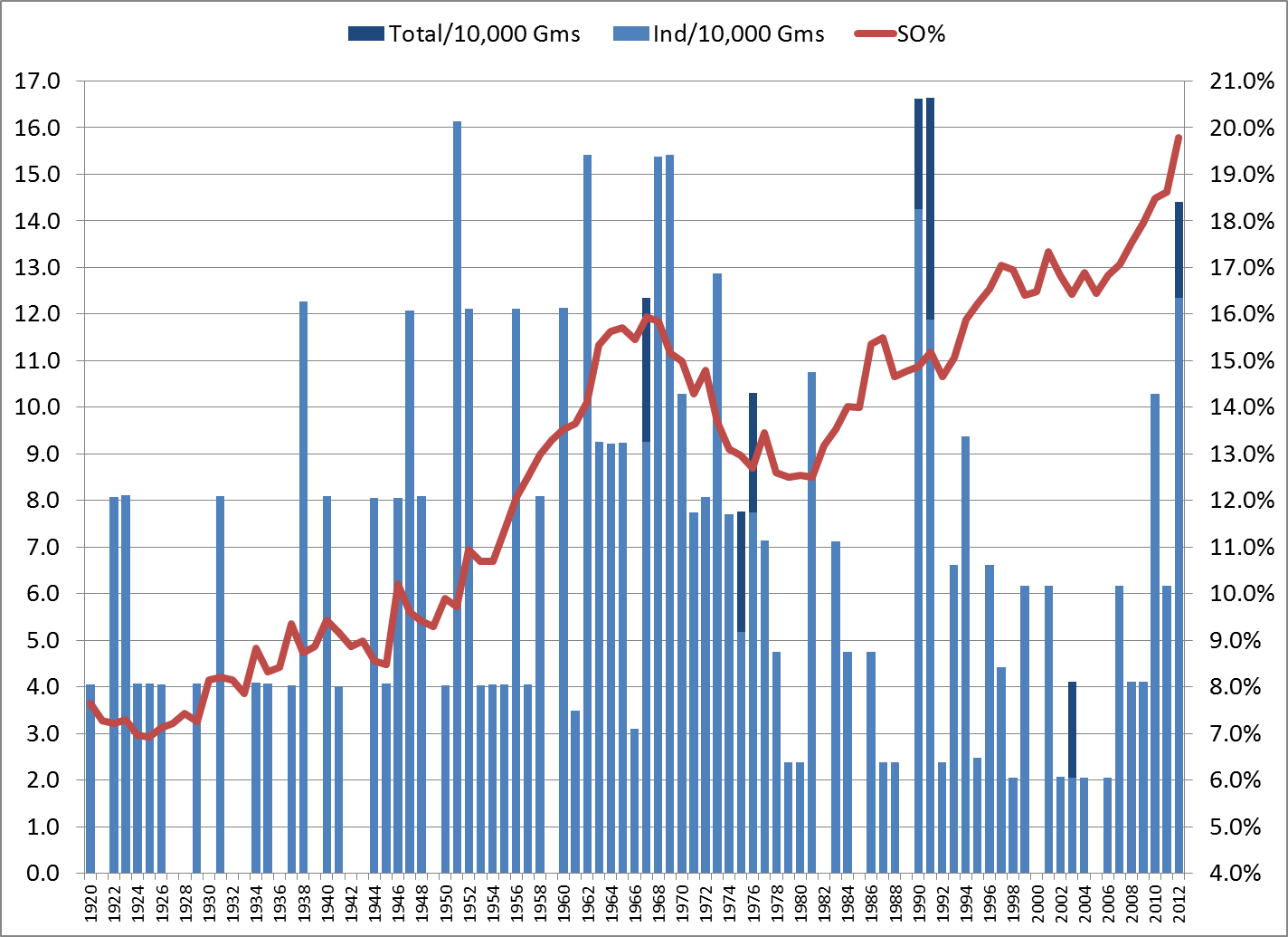
Yikes, what a mess! The only point of this graph was to show that you really can’t learn anything from a couple of seasons; there’s too much annual fluctuation.
But now let’s take the same data in rolling 5-year averages. In other words, the 2012 data points are actually the averages for 2008-12, and so forth. (Except that no pre-1920 data was used, so the points for 1920-23 represent the averages from 1920 through that year.)
Rates of No-Hitters and Strikeouts, Rolling 5-Year Average, 1920-2012
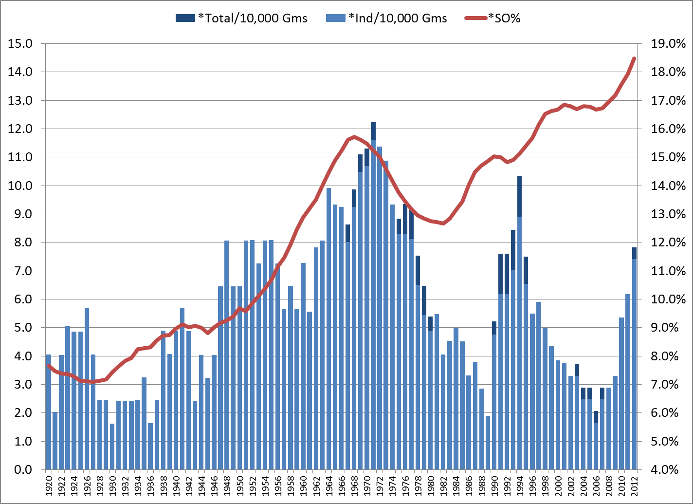
Now, that’s a little more interesting. Starting from the left side, there does seem to be some correlation. But it starts to loosen up in the 1980s, and completely breaks down in the ’90s. Very recent trends might indicate a return to correlation, but it’s too soon to say. And of course, we’ve yet to see a no-hitter in 2013.
_______________
Grouping Like with Like
The next method is to forget about time periods and just group the yearly data by K rates. I sorted the seasons by SO%, then divided them into three equal groups of 31 seasons: Low-K (averaging 8.3% strikeouts), Medium-K (13.2%) and High-K (16.6%). The no-hitter rates, per 10,000 team games:
- Low-K: 4.3 individual (4.3 total); 8.3% K rate
- Medium-K: 6.1 individual (6.3 total); 13.2% K rate
- High-K: 6.0 individual (6.4 total); 16.6% K rate
Conflicting pictures here. The difference between the Low-K and Medium-K groups suggests a correlation. But the no-hit rate is about the same for the Medium-K and High-K groups, despite a sizable difference in K rates (26% more in the High-K group) and a large number of seasons.
Now let’s break it down a little finer.
I formed five groups of 18 or 19 seasons: Min-K (averaging 7.7% strikeouts), Low-K (9.8%), Medium-K (13.2%), High-K (15.2%) and Max-K (17.2%, consisting of 1995-2012). The no-hitter rates:
- Min-K: 3.4 individual (3.4 total); 7.7% K rate
- Low-K: 6.2 individual (6.2 total); 9.8% K rate
- Medium-K: 5.9 individual (6.2 total); 13.2% K rate
- High-K: 7.8 individual (8.2 total); 15.2% K rate
- Max-K: 4.4 individual (4.7 total); 17.2% K rate
The first four groups suggest a pattern. But what happened to Max? Again, those are the 18 highest season K rates in MLB history. Yet the no-hit rate for those years is far, far less than for the next-closest K group. How could you possibly fit that into a theory that no-hitters and overall strikeout rates remain directly correlated?
_______________
You might see where I’m going, but this is the end of Part 1. In Part 2, I’ll discuss the unstated assumption behind the correlation theory, and why that assumption no longer holds true.
_______________
Postscript
Besides small sample sizes, Mr. Verducci made an odd choice in citing the no-hit rate for the late ’60s. If you read the piece, you might have noticed the years that he labeled as the “late-1960s doldrums.” He chose 1967-69 as a point of no-hit comparison to 2010-12 — even though he’d already noted that 1969 was profoundly different from the prior years: “hitting was so bad they … lowered the mound (1969)….”
To further state the obvious: From 1968 to ’69, the K rate fell from 15.8% to 15.1% (the lowest rate since 1962), while batting average rose from .237 to .248. The number of plate appearances per team-game rose by 2.4%, from 37.2 to 38.1, the largest absolute change since 1904. On top of all that, there was an expansion from 20 to 24 teams.
So why lump together 1969 and 1967-68? I surely don’t know, but it’s hard to miss the fact that 1969 had 6 individual no-hitters, tying the live-ball record, while 1967-68 totaled 8 individual no-hitters, and 1966 had just 1. By using 1967-69, he showed a no-hit rate similar to 2010-12, but still higher than 2010-12 — sort of implying that we’re headed that way. Had he used the more reasonably connected 1966-68, it would have shown that the 2010-12 rate was already much higher than “the late-’60s doldrums,” which might have raised questions about small sample sizes. Even those folks who mistakenly think we’re in a sub-normal scoring context know that we’re nowhere near 1968.
If that 1969 data point meant anything, it would be a direct counterpoint to Verducci’s thesis. But one year, or three years, don’t mean anything when you’re studying something as rare as no-hitters.
Tour de force, John.
The high-strikeout era has also corresponded with higher BABIP. This suggests that the strikeouts are just replacing outs that formerly were being made on balls in play. Ergo, fewer balls in play doesn’t necessarily mean fewer hits.
And Doug gets the prize for anticipating Part 2. 🙂
Which goes to the heart of the problem: strikeouts are only an influence on the probability of no-hitters indirectly, that is, only if they reduce batting averages. It seems like frumpy old batting average, one of the sabermetrician’s least favorite stats, would be the most obvious stat to correlate with no-hitter frequency. Only if K rate actually lowers batting average should it, theoretically, have an (indirect) effect on no-hitter probability.
It’s likely that other factors have an important effect on no-hitter frequency. One indisputable fact about no-hitters is that they happen more frequently in September than any other month (21.5% of no-hitters happen in September, compared to the next most-frequent month, May, at 16.7%). Which suggests to me that, as one might expect, no-hitters increase when one team is trying less hard to win than the other team. By this I don’t necessarily mean the players are trying less hard, but that teams out of the pennant race in September are more likely to be using green, over-matched September call-ups more vulnerable to being held hitless by experienced major league starters. So competitive balance levels may be one thing that affects no-hitter frequency.
Well put, birtelcom. You guys are reducing my Part 2 to an afterthought, but I’m gonna run it anyway. 🙂
One of the wonderful things about posting on this site is that if I want to write up an idea with several added thoughts, I often don’t even have to mention the additions — our amazingly smart community of commenters will follow up quickly and do it for me.
Verducci is often good. I didn’t see that article but that sounds sloppy as heck. I remember after about a quarter season’s worth of games at NYS in 2009 the HR rate was almost 4 and people were talking about how the park was an embarrassment and how the Yankees had done such a poor job and, well, the HR rate declined the rest of the year and while it is still fairly high it is not at all ridiculous and it helps not to be shortsighted about the fact that the Yanks are a power team and mash homers a ton on the road. But that’s not even the best example of why I even mention it in response to your article. The next year, after *six* games in Yankee Stadium an article on ESPN ludicrously asserted that the HR rate had declined from the dizzying highs of (the beginning of) the previous season. I scoffed and wrote a blog post about it.
Verducci’s small sample size isn’t as bad so I don’t feel as strongly about his unfortunate conclusions though I expect better writing from a man as smart as he. But my mind is still blown remembering that an ESPN article tried to draw conclusions about the 2010 HR rate of Yankee Stadium after six games.
Anyway, good piece JA.
Thanks, Fireworks. Just after I posted this, I happened to hear Mr. Verducci on the Fox broadcast of the Mets-Braves game; I’d forgotten he was part of their crew. I was impressed with his commentary. He obviously has great intelligence and knowledge of the game.
At the same time — and this is just my opinion, based on a small portion of his writing — I don’t think he has a scientific bent. Probably his best-known writing is his theory that injury risk for young pitchers increases dramatically if their workload increases by more than about 30 innings from one year to the next; and the analytical methods he used there have been widely criticized.
And further on in the no-hitter piece was this:
________
We’ve essentially brought the game back to pre-DH levels. This has been an undeniable trend over a decade, but especially in the past four years. The major league batting average has declined for six straight years. Go back to 2000 — the height of The Steroid Era — and the major league average was .270 with 10.28 runs scored per game. Now it’s .253 and 8.60 runs per game. That’s a 16 percent cutback in scoring. In raw numbers, based on projected numbers for this year, that means pitchers have removed 4,086 runs and 3,461 hits from a baseball season.
________
That analysis is fundamentally flawed. He’s making a case that the game is now pitcher-dominated, by comparing to offensive rates of the Steroid Era? How about comparing to historical norms? It’s like saying that offense was out of control in 1969-70, because it was so much higher than 1967-68. It’s misleading and pointless. 1969-70 was normal; the preceding years were the aberration. Same now.
And “pre-DH levels”? That’s complete hyperbole. The scoring average for 1971-72 was 3.89 and 3.69 R/G; the scoring average for 2010-12 was 4.38, 4.28 and 4.32. Half a run per game is a big difference. The batting average for 1971-72 was .249 and .244; for 2010-12 it was .257, .255 and .255. I don’t understand how such a smart, knowledgeable person could make that comparison.
In a broader sense, one should be extra skeptical about perceiving league-wide trends from a small set of individual brilliant performances. Our brains are hard-wired to recognize patterns, even when there really isn’t anything meaningful.
I want to apologize in advance for a long-winded and poorly-edited post. Today I have watched MLB, NASCAR (yes really), college softball, college baseball, and the D1 women’s lacrosse championship and I’m too tired (lazy) to employ my filter.
I’ve noticed that more than other sports, baseball analysts and writers tend toward hyperbole, emphasizing small differences and samples as much more significant than they are. The other day watching the Yankees someone in the Yankees booth (Singleton?) referenced… Gardner’s (?) 0-2 history against Rodney (?) as having some role in a managerial decision (or non-decision).
We’ve been hearing “Year of the Pitcher” for a couple years now and having a more nuanced understanding of both historical and recent offensive levels I take that as a relative comparison to the offensive era immediately proceeding it. Acting as if every team is hitting like the 2010 Mariners is quite overstating it but I get that sort of vibe from many of the old school baseball people.
The other day I heard someone on MLBN discussing the run-scoring levels and they said that hitters have failed to adjust and maybe need to stop getting into deep counts and so on.
Firstly, even cursory analysis of baseball’s run-scoring history shows that there is a continual battle between offense and defense (something that is true of all sports) and that when offensive levels plummet too much (appropriately adjudged to foster a decline in [casual] fan interest) leagues (in all sports) will adopt new rules and interpretations of existing rules (as well as the natural adjustments organizations and players make to a changed/changing nature of the game) in order to foster scoring.
These adjustments don’t happen overnight. They happen over time when a different sort of tactic or player proves (seems) to be successful in the “new” environment.
The reason I bring it up is that there was a certain sort of shrillness to the comment, a sort of unspoken criticism of the way front offices evaluate players now (with sabermetrics).
There is this idea among the old school baseball people that sabermetrics is this really rigid thing and that the things that they may say about a particular run-scoring environment (the Moneyball era A’s lack of interest in stealing bases), or about certain tactics in general (managers should stop bunting so much) is the only thing there sabermetricians have to say on the issue, or that it applies to every situation. I guess those are situations where a sabermetricians propensity for a bit of hyperbole hurts rather than helps.
There is also a lack of basic understanding about the purpose of sabermetrics and analysis, a lack of respect for consistent and (attempts at) objective analysis.
They also do not understand that basic stats really only tell you with any sort of clarity precisely what they are telling you, and that attempts to evaluate players without understanding the limitations of such stats or embracing statistics that, whatever their flaws, are attempts to objectively value various events and outcomes is the *only* way to do things in a world where we acknowledge that sound methodology is far more useful than appeals to expertise (or “gut”).
I just don’t get how guys like Harold Reynolds don’t get that a formula developed by something attempting to create an objective baseline for evaluation is better than the very unique, subjective, and not quite illuminated without exhaustive discussion sort of analysis that we perform in our own in our minds. We all know that a .300/.400/.500 guy playing 81 games in Petco is better than a guy with the same numbers in Coors. We should all strive to develop and support analytical tools that allow us quantify/estimate how much better it is rather than all of us sit around with wildly different interpretations of how much better it is.
Of course I can’t find the link to the ESPN article anymore, however, I did eventually pretty much write the vast majority of the section of the Wikipedia article on Yankee Stadium defending the decline in HR rate. I’ll be so feckless as to repost it here because I don’t post much anymore and I like a good opportunity to get JA to agree with me.
“The number of home runs hit at the new stadium slowed significantly as the season progressed,[68] but a new single-season record for most home runs hit at a Yankee home ballpark was nonetheless set in the Yankees’ 73rd home game of 2009 when Vladimir Guerrero of the Los Angeles Angels of Anaheim hit the 216th home run of the season at the venue, surpassing the previous record of 215 set at the original Yankee Stadium in 2005.[69]
It should be noted that the Yankees offense, as in previous years, employed many home run hitters in 2009. The Yankees hit 108 home runs while playing on the road, the second most in baseball behind the Philadelphia Phillies.[70]
In 2010, the early rate of home runs were markedly less through May 15, 2010, with 35 home runs hit in 14 games for 2.5 per game (a projection of 205 – in 2009, the stadium finished at 2.93 per game for a total of 237.) Even though the stadium’s home run rate decreased slightly for the 2010 season to 2.73 per game, it was still the highest figure in the majors.[71] However, the prolific home run rate of April and May 2009 that drew criticism has not sustained itself over any season thus far, and while through the first two months of the 2011 season the Yankees hit far more homers than any other team in the majors,[72] Yankee Stadium was not the top home run park.[71]”
I am especially fond of the last sentence.
It really burned me up seeing guys like Gammons and Olney on ESPN calling the park a joke. I am not aware of any sort of apology from them on how they crapped all over the park and the Yankees organization, nor would I expect it, which is why whenever I remember to do so I fail to have much respect for Gammons.
Anyway, connecting my Yankee vitriol again to what you wrote, there is nothing so tragic as conclusions reached without account for an appropriate sample size because most of the people that read such poorly-written articles aren’t going to be knowledgeable enough (or observant enough) to realize that the assertions made are sometimes as baseless or weak as they might be if the author didn’t even bother to cite any statistics.
Perfect example of one of the many reasons I do so love this site- challenging conventional wisdom and picking it apart piece by piece until you prove that that which “everyone knows” ain’t necessarily so.
Well done (as always).
Loney hit a homer! I was just thinking, for such a great hitter he doesn’t homer much.
Loney is actually a good hitter, I should not have said great. He’s a perfect fit for the Rays, and I am not surprised he is having a great year. Look for a run by the Rays this summer. If David Price had been on track and not hurt, the Rays are the best team top to bottom in that division. They also have the best manager in baseball.
JA:
Any figures on the average number of SOs per no hitter over time? Not relevant to the big picture, but of interest, perhaps.
nsb — Interesting question, and I did go down that path a bit before backing off. Not so much on the distribution of Ks in no-hitters over time, but more, the number of no-hitters with X Ks, out of the total games with X Ks.
I do have some data, not sure how to present it.
One thing that I found very interesting is that there are only 2 no-hitters with 16+ strikeouts, both by Nolan Ryan (16 and 17). Here’s a paragraph that I cut from the piece:
__________
There are 243 regulation team-games with 16+ Ks within the study period. Granted, 2 no-hitters out of these 243 is a rate far more than normal. On the other hand, both came from the guy who has as many no-hitters as nos. 2 and 3 combined. So is the correlation between strikeouts and no-hitters, or between Nolan Ryan and no-hitters?
__________
I cut it because it became clear that, on a game level, strikeouts do correlate with no-hitters. Almost across the board, the no-hit rate goes up as the number of strikeouts goes up.
I didn’t go deep into that fact, not because it went against the grain of my post, but because it’s an after-the-fact analysis; it has no predictive value.
But also, more in answer to your question, I found that for almost every K level, the no-hitter rate at that level was much greater for 1920-85 than for 1986-present.
So many players wearing beards. I don’t like this trend.
Great piece. My inner statistician really needs to see the sigma squared deviation though. Basically, you’re projecting a standard bell curve for the probability of days between a no hitter and then compare that to the data to see if it’s more… clumpy than a standard random distribution. If it’s clumpy, that would imply some causality link with something (assuming the sample size is big enough, which I think we actually have here given the live ball era). If it’s not particularly clumpy, you would then imply that small sampling size combined with the rarity of the event is giving the illusion that they are more or less common than expected given different time periods when in fact they are not.
If I could get my hands on some basic data like the number of games played and the number of no-hitters over a given time period as well as the yearly no hitter totals/games played totals I could put it together.
Sigma Squared Deviation: http://en.wikipedia.org/wiki/Squared_deviations
Thanks, mosc. I’m sending you an Excel file with the data. Go to it!
Pingback: High Heat Stats » Jumping in with Two Feats